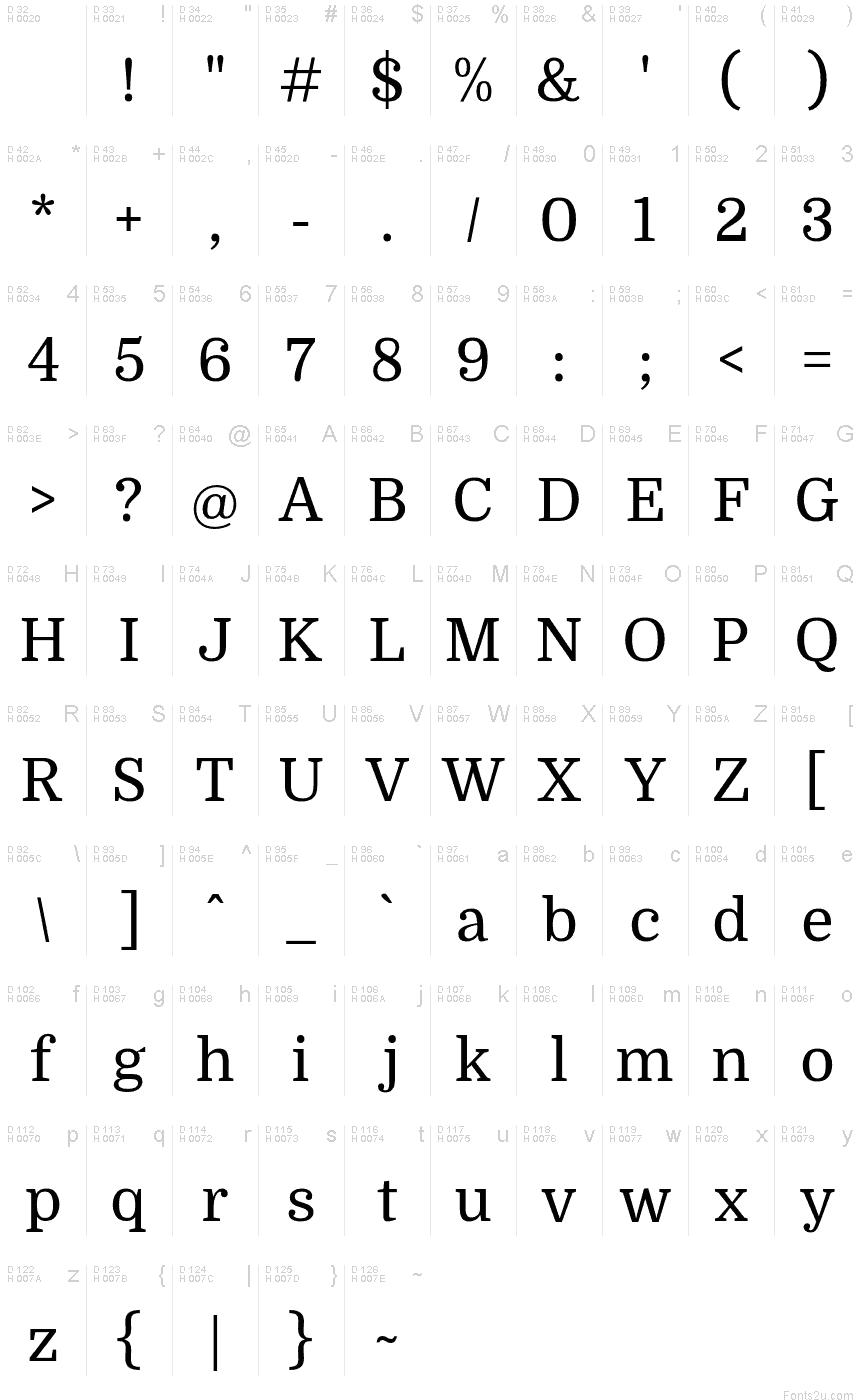
Domine
TrueTypeBezplatný
- Akcenty (částečné)
- Akcenty (plné)
- Euro
Domine-Regular.ttf
Tagy
>Tabulka znaků
Prosím, použijte roletové menu ke shlédnutí různých tabulek znaků obsažených v tomto písmu.

Základní informace o písmu
Informace o autorských právech
Copyright (c) 2012, Pablo Impallari (www.impallari.com|impallari@gmail.com),
Copyright (c) 2012, Rodrigo Fuenzalida (www.rfuenzalida.com|hello@rfuenzalida.com),
Copyright (c) 2012, Brenda Gallo (gbrenda1987@gmail.com), with Reserved Font Name Domine.
Copyright (c) 2012, Rodrigo Fuenzalida (www.rfuenzalida.com|hello@rfuenzalida.com),
Copyright (c) 2012, Brenda Gallo (gbrenda1987@gmail.com), with Reserved Font Name Domine.
Rodina písma
Domine
Podrodina písma
Regular
Jednoznačné označení podrodiny
PabloImpallari,RodrigoFuenzalida,BrendaGallo: Domine: 2012
Celý název písma
Domine
Verze tabulky názvu
Version 1.000; ttfautohint (v0.93) -l 8 -r 50 -G 200 -x 14 -w "G"
Postscriptový název písma
Domine-Regular
Informace o ochranné značce
Domine is a trademark of Pablo Impallari
Výrobce
Designer
Popis
From the very first steps in the design process 'Domine' was designed, tested and optimized for body text on the web.
It shines at 14 and 16 px. And can even be used as small as 11, 12 or 13px.
Harmless to the eyes when reading long texts.
Domine is a perfect choice for newspapers or magazines websites, where text is the main focus.
It's is friendly in appearance because it combines the classic elements of familiar typefaces that have been in use from more than 100 years like Clarendon, Century, Cheltenham and Clearface.
- The rounded letters (b, c, d, e, o, p, q) are a bit squarish on the inside. This feature opens up the counters for better rendering and also make it look a bit more up-to-date than the classic typefaces previously referenced.
- The serifs are a bit shorter than usual. Another feature that improves the rendering by allowing more "air" between each letter pair.
- The joins of the stems to the branches in letters like h, m, n are deep enough to prevent dark spots, also improving legibility at small sizes.
- The friendly lowercase 'a', with the curve starting from the bottom of the stem, is reminiscent of Cheltenham and Clearface. That soft curve is also echoed in the curves of the f, j, n, m and r.
- The spacing is also optimized for body text on the web, clearly more open than that of typefaces made for print or for headlines.
Rozšířené informace o písmu
Podporované platformy
PlatformaKódování
UnicodeUnikód 2.0 a následná sémantika, jen BMP Unicode
MacintoshZápadní (roman)
MicrosoftPouze BMP Unicode
Podrobnosti o písmu
Vytvořeno2012-11-28
Revize1
Počet znaků437
Jednotek na Em1000
Práva pro vkládáníVložení pro trvalou instalaci
Rodinná třídaVolné patky
VáhaStředné (normální)
ŠířkaStředné (normální)
Mac styleTučné
SměrJen znaky směrovány zleva doprava + obsahují neutrály
VzorekNormální
VelikostRůzná
Úplný balíček obsahuje 2 vah písma, uvedených níže:
Domine-Regular.ttf
Domine-Bold.ttf
Domine-Bold.ttf
Domine Bold
TrueTypeBezplatný