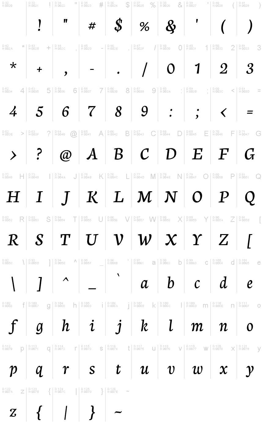
Neuton Cursive
TrueTypeBezplatnýBylo aktualizováno
- Akcenty (částečné)
- Euro
NeutonCursive-Regular.ttf
Tagy
>Poznámka autora
My little project. More variants coming soon!
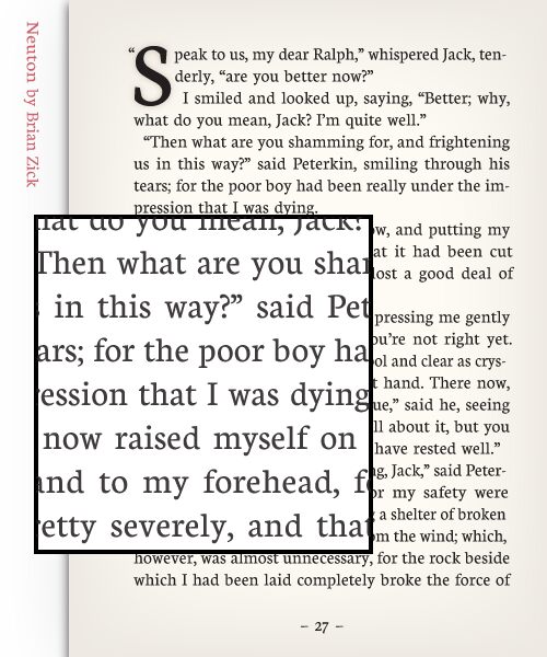
Thank <a href="http://MSDesigns.deviantart.com/">Martin Silvertant</a> for the excellent promo image here!
Neuton is licensed under SIL OFL and is free for commercial use. However, donation is highly appreciated .
Let me know if you use it!
Basic Font Information
======================
Neuton is a clean, dark, somewhat Dutch-inspired serif font which reminds you a little of Times. It has a large height, short extenders, and a compact width for better screen use, and economy of space.
The family will comprise a regular, italic, and cursive, each in five weights and with smallcaps. Two italics one will be called "italic", and the other "cursive" are uncommon, but very useful. Ever tried emphasizing something already emphasized? Beyond that obvious example, there are other uses.
Sometimes a text needs a different flavor or feel. While one roman can work for a variety of texts, the companion italics don't always. In more classical or personal documents, a stiff, sober, modern and down-to-earth italic will never work. And in many essays, some of the fancier italics look ridiculous. Who said a roman needs only one companion?
Neuton is in continuing development and will come to have:
* 5 weights, from Extralight to Extrabold
* Italic and Smallcaps versions
* A cursive variant
* Extended width versions
>Tabulka znaků
Prosím, použijte roletové menu ke shlédnutí různých tabulek znaků obsažených v tomto písmu.

Základní informace o písmu
Informace o autorských právech
Copyright (c) 2010, 2011 Brian M Zick (http://21326.info/),
with Reserved Font Name 'Neuton Cursive'.
This Font Software is licensed under the SIL Open Font License, Version 1.1.
This license is available with a FAQ at: http://scripts.sil.org/OFL
WITHOUT WARRANTIES OR CONDITIONS OF ANY KIND, either express or implied.
See the License for the specific language governing permissions and
limitations under the License.
Rodina písma
Neuton Cursive
Podrodina písma
Regular
Celý název písma
Neuton Cursive
Verze tabulky názvu
Version 1.46
Postscriptový název písma
NeutonCursive-Regular
Designer
Rozšířené informace o písmu
Podporované platformy
PlatformaKódování
MicrosoftPouze BMP Unicode
MacintoshZápadní (roman)
UnicodeUnikód 2.0 a následná sémantika, jen BMP Unicode
Podrobnosti o písmu
Vytvořeno2012-03-29
Revize1
Počet znaků228
Jednotek na Em2048
Práva pro vkládáníPísmo s licencí (chráněné)
Rodinná třídaVolné patky
VáhaStředně tučné
ŠířkaStředné (normální)
Mac styleTučné
SměrJen znaky směrovány zleva doprava + obsahují neutrály
VzorekKurzíva
VelikostRůzná
