Ode an Erik AH
TrueTypeGNU/GPLBylo aktualizováno
- Akcenty (částečné)
- Euro
Ode-Erik.ttf
Tagy
>Poznámka autora
Ode an Erik, designed by FontGrube AH, is a striking brush-style typeface that exudes a captivating blend of vintage charm and modern flair. Inspired by the title graphics of classic German TV police series from the 1960s and 70s, this font boasts a bold, expressive personality that commands attention. Its robust strokes and dynamic curves convey a sense of movement and energy, evoking a feeling of intensity and drama.
This versatile font lends itself beautifully to a wide range of design applications, from bold headlines and impactful branding to eye-catching signage and captivating editorial pieces. Its strong character and multi-language support make Ode an Erik an excellent choice for projects that require a distinctive, attention-grabbing typographic treatment.
This versatile font lends itself beautifully to a wide range of design applications, from bold headlines and impactful branding to eye-catching signage and captivating editorial pieces. Its strong character and multi-language support make Ode an Erik an excellent choice for projects that require a distinctive, attention-grabbing typographic treatment.

>Tabulka znaků
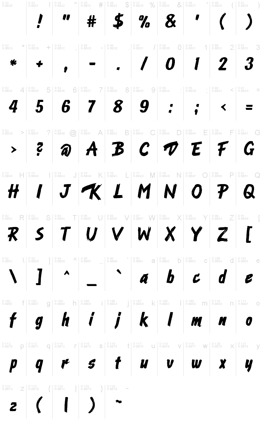
Prosím, použijte roletové menu ke shlédnutí různých tabulek znaků obsažených v tomto písmu.

Základní informace o písmu
Informace o autorských právech
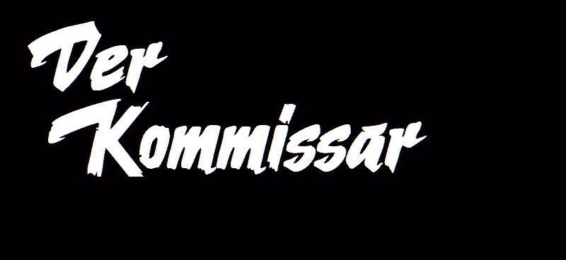
Nach dem Logo der Krimiserie "Der Kommissar" mit Erik Ode
Rodina písma
Ode an Erik AH
Podrodina písma
Regular
Jednoznačné označení podrodiny
Ode an Erik AH
Celý název písma
Ode an Erik AH
Verze tabulky názvu
Version 2.00
Postscriptový název písma
OdeanErikAH
Výrobce
Fontgrube AH
Popis
This typeface originates in the Title graphics of the German TV police series "Der Kommissar" (The Police Commissioner) broadcast in 1969 to 1976.
The graphic title consists of fast, bold brush strokes and was hand-made. The letters were scanned and digitized, and from that material almost all of the lowercase characters could be derived. Uppercase and figures took inspiration from other sources which were adapted to fit the general character of the typeface.
The font works with many (mainly West-)European languages, such as English, German, French, Spanish, Italian, Portuguese, Danish, Swedish, Norwegian, Islandic and Turkish.
The name of the font alludes to the actor who played the main charakter, Erik Ode. In English it means "Ode to Erik".
Licence
Ode an Erik AH is available as a free font under the SIL Open Font License with the reserved name “Ode an Erik”. For details see https://scripts.sil.org/OFL
URL licence
Rozšířené informace o písmu
Podporované platformy
PlatformaKódování
UnicodeUnicode 1.0 sémantika
MacintoshZápadní (roman)
MicrosoftPouze BMP Unicode
Podrobnosti o písmu
Vytvořeno2024-04-24
Revize1
Počet znaků230
Jednotek na Em1000
Práva pro vkládáníVložení pro trvalou instalaci
Rodinná třídaPsané
VáhaTučné
ŠířkaStředné (normální)
Typ šířkyNormální
Mac styleTučné
SměrJen znaky směrovány zleva doprava + obsahují neutrály
VzorekKurzíva
PostaveníVzpřímené
Váha tahuKnižní, textová, normální atd.
VelikostRůzná
Sada symbolůWindows 3.1 ANSI